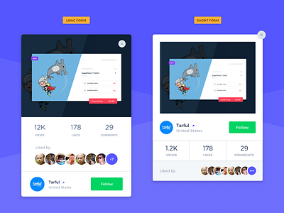
Shot Card variations
Hey guys, working on a few ideas for this Shot Card, the idea is to be able to show all this information without adding too many elements...
- Left: is a bit longer but shows a bigger image and all content is only in 2 boxes (removing extra lines)
- Right: although this version is shorter, it has more elements and different colors...
What do you think about these 2 options. We'll love to get some feedback!
Also, worth to check out our others channels:
Instagram, Twitter
More by Tarful View profile
Like
