Six years later
I felt like bringing this design back lighter, cleaner, and brighter.
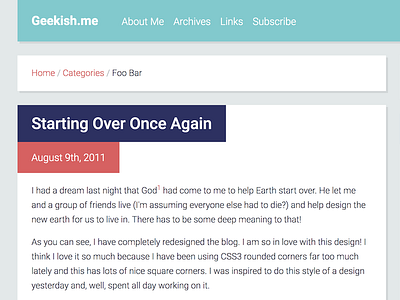
Full screenshot:
https://cl.ly/1w0J3K2o0A1W
Unsure about:
- What to do about posts with short titles
- Using red for post dates, since the color usually denotes urgency; the title is more important
- Placement of the menu; I would like to place some social media icons or the search bar to the right, otherwise the links will be put there
- What color to use for the sidebar 'widget' headlines, using the same color as the header seems wrong
- Styling of the search bar is obviously unfinished... it depends on whether it's moving to the header or not
- The color for the 'muted' text is too light in the screenshot, I used the wrong SASS variable
Color palette inspiration:
https://www.design-seeds.com/wander/wanderlust/color-detail-4/