Nutshell Reports Home

A discarded design is always 😞 but…
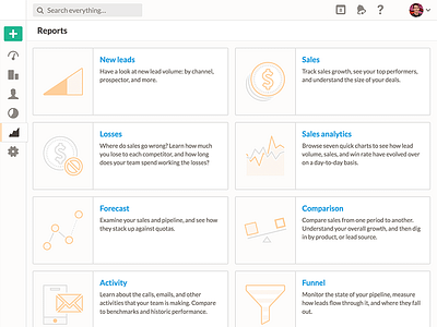
The tiled, icon layout is pretty and descriptive but users want to see rolled up data/charts when landing in the reports section of a CRM and not a giant menu 👌.
A discarded design is always 😞 but…
The tiled, icon layout is pretty and descriptive but users want to see rolled up data/charts when landing in the reports section of a CRM and not a giant menu 👌.
