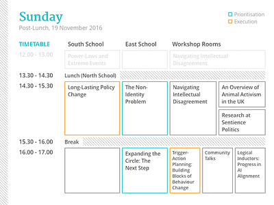
Schedule: Sunday (Day 2) v2 (post-lunch)
Now to explain the weaknesses of this layout:
> Try locating "Navigating Intellectual Disagreement" in the schedule. We reserved 3 rooms to be used for the workshop sessions, but from a quick glance alone there'd be no way somebody can tell whether this particular session takes place in Room 6, 7 or 9. The information is indeed available in the details printed below, but it impeded user's ability to make quick decision to switch between venues midway.
Cause: There are irregularities in how the schedule was arranged with rooms sometime being occupied for different reasons (such as interviews, or to facilitate ad hoc discussions). The layout ran out of dimensions to use (x and y axis) and space (paper size: A5).
Solution: It might have been helpful to add a small number on the bottom-right corner of the boxes to indicate the rooms allocation.
> Try checking "An Overview of Animal Activism in the UK" and "Research at Sentience Politics". Due to the way the boxes are evenly divided for consistency, it induces this bias that both sessions have an equal length of 30 mins each. This wasn't always the case as some sessions can be a 45-min long presentation with extended Q&A session.
Cause: The scale of time (y-axis) was relative to each other, and thus we can't give an accurate representation of the sessions' timeline.
Solution: We can add a greyed out indicator under the time column with an equally reduced-opacity line highlighting the start of an uneven sessions.
