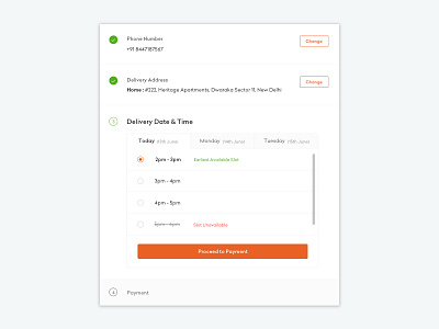
Checkout Process
Grofers’ checkout process uses one card in form of accordion. The problem was to make user focus on one task at one time while still assuring her about the information she has provided and the things she is about to purchase. The main content has a white background asking for user’s information and all the secondary information has a grey background so it doesn’t turn into distraction.
You can look at the full screen image to get a better idea. :)
More by blinkit View profile
Like

