Japan Paper Expo promotional poster
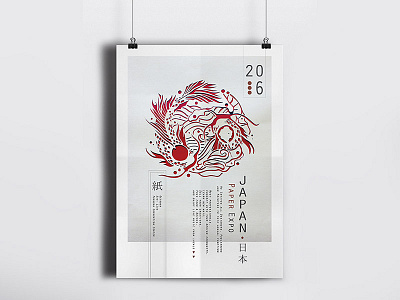
Japan Paper Expo is a prestigious annual event, targeted towards designers, publishers, printers, and other creatives in the field. The poster was inspired by Japanese art of paper-cutting, kirigami and kirie, which involves very delicate hand work and great attention to detail. A number of symbolic elements were integrated into the design to represent Japan’s rich culture and traditions – the circular form mimics the Japanese flag, the Koi Fish is a symbol of good fortune and luck, and the aquatic pattern, as inspired by kimono prints. Typography is a crucial element in the poster design as it mimics Japanese style of writing. The texts have all been arranged vertically in a hierarchical order, from right to left, and combined with kanji characters to create an illusion of a stamp that is often used in Japanese prints. They have been positioned meticulously to fit the shape of the red circle to provide a dynamic composition that is aesthetically engaging the viewers.
Check out the rest of the project here!
https://www.behance.net/gallery/29570351/Japan-Paper-Expo-2016
Feedback most welcomed :)
