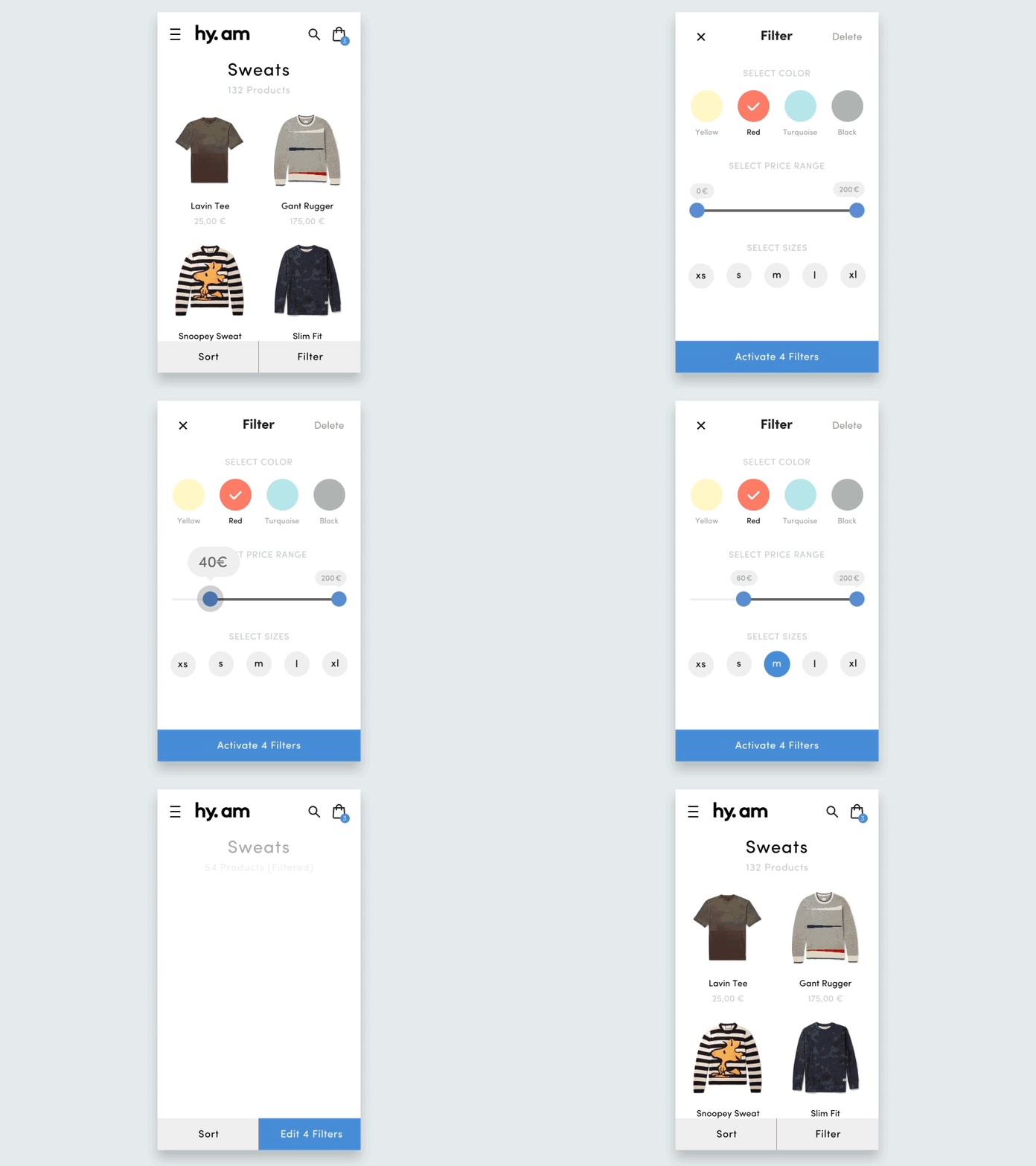
Ecommerce Filter Animation
Hi everyone!
Me and @Mario Wahl had some spare time at @hy.am studios and played around with an animation concept for a filter page in a mobile ecommerce experience.
Our concept was to include all the filter options in one screen, so that the user can be focused on the task at hand withouth having to browse complicated page-subpage structures. This method works, of course, only for shops with relatively few products and filter options.
Hit that L if you like it!
Design by @Dario Ferrando
Animation by @Mario Wahl
More by HY.AM STUDIOS View profile
Services by Dario Ferrando
Like
