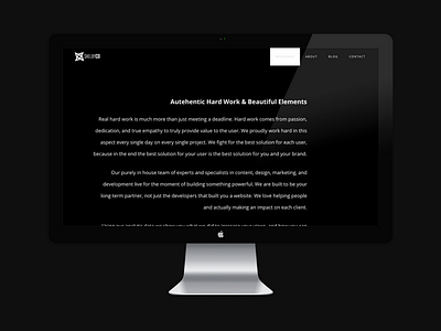
Shelby Company Approach Page
Black background and white text always looks stellar. Offsetting it with a right orientated title gives it a unique look and flows on the page well as it transitions on our site! I hope you like it. 👨💻
More by Zac Nielson 🏴 View profile
Like
