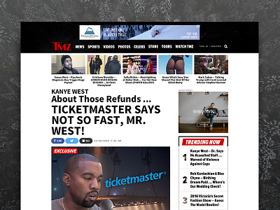
Article Redesign
Role: Design Director / Lead Designer
This design was created to increase click-through and time spent for users coming in from side-door traffic (ie: social, google, email etc.)
We de-cluttered the right rail and made it sticky, added a continuous blog roll of stories below the main article, and created containers for 3rd party content. These are just a few updates made in this new version of the article page.
Check the motion test attached.
article-animation-dribbble.mp4
3 MB
More by Carlos Mortera View profile
Like

