Pico Digital Film


Hey everyone! I launched a new app today called Pico Digital Film. In it, you can shoot with 8 different film styles on your iPhone.
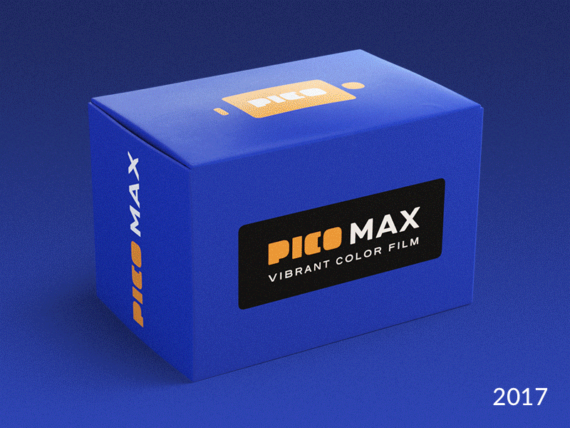
Just for fun, "The Pico Film Company" has a little fictional history. I made the app project kind of a "package design project" for myself since that's a thing I don't usually get to design. I made 23 different boxes, and my friend Patrick Letourneau modeled these really cool appropriately-aged boxes for each one. Check out the attachments for more models and an example of the flattened box art.
It was kind of fun to imagine a brand that has existed for 50 years. What happens in that time? How does each decade influence the design? How does its design influence the decade? There are a few logo changes, some tropes, things that felt appropriate for each rebrand. You can tell when The Pico Film Company felt like they had a good thing going like with the wordmark on the 1995 box. So it changed very little in 2012, even though the box did. Or the Pico logo itself, once it changed in 1973, you can see how it evolved ever so slightly into what you see in the 2017 version. Or how in 2012, there wasn't digital film, but in the 2017 versions you can see a "phone" silhouette around the logo on the top of the box. Or the 1995 "tagline" next to the logo.
This was a lot of fun. I think as I design more apps in the future, I'll want to do this kind of exercise again. Make it feel like it's been around for a while. Give it history. Because that'll inform what the current product is, does, and looks like.
Read more about the app here: https://medium.com/@mantia/pico-digital-film-5ad232977394
