Jewelry E-Commerce App
Hi dribbblers!
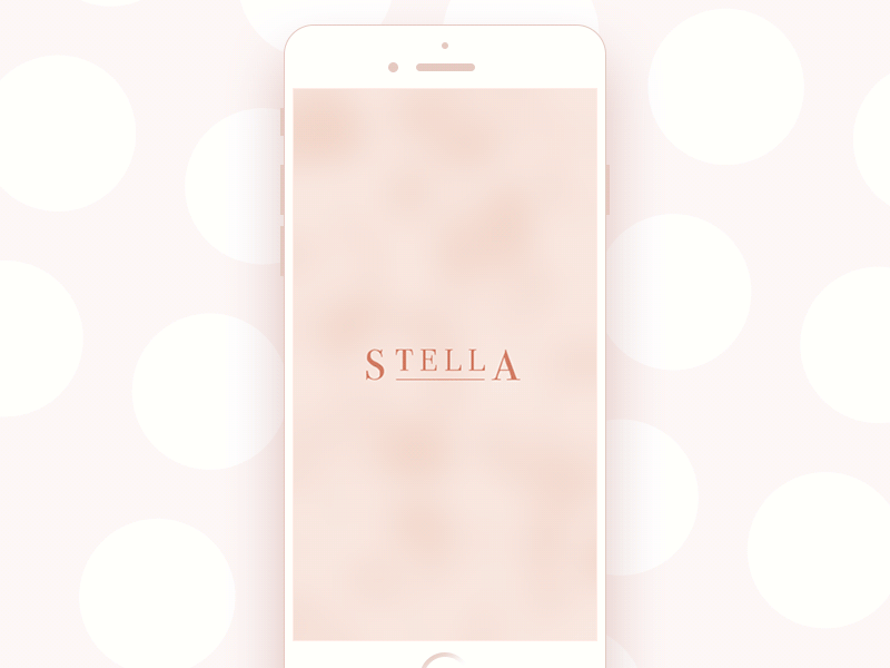
It's time for a new week of spring – why wouldn't we start it with a bit of glamor? Today's shot is all about luxury and sophistication: it presents a new set of interactions for the app design concept of the online jewelry shop. The presented screens show the starting point of interaction with the app from the splash screen to the catalog showing categories of goods and special offers. The app provides theme photos setting the instant visual associations with the offered items while icons are stroke and minimalistic not to distract buyers' attention. The color palette features pastel shades which look sophisticated on general layout full of light and air, and that feeling is supported with smooth and unobtrusive animation of the interface elements. Credits for the UI concept to Dima Panchenko.
To share more ideas we get working on design projects and concepts, we regularly update Tubik Blog with new articles. One of the latest post presents the article Color Theory: Brief Guide For Designers. Join in!