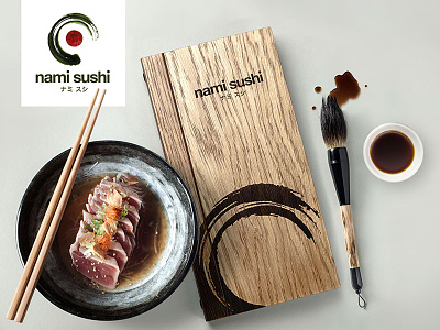
'Nami Sushi' brand and photography
The Nami logo uses an 'enso' or 'zen circle' painted with a Japanese brush in a dark nori (seaweed) green. A red centre is included to represent the Japanese flag and together this looks like 'Norimaki' (a typical sushi dish). 'Nami' means 'wave' in Japanese and the 'enso' can be cropped to appear like a wave as an additional graphic for the brand.
See more at https://www.behance.net/robinzahler
More by Robin Zahler View profile
Like
