New goals interface


Last summer, our design team visited our customers across the country to discover how people use our software. We were all caught off guard by the amount of UX flaws overlooked through the years. This put a core focus on revisiting our platform’s infrastructure over the next couple of quarters.
Uncovering the problem
Working closely with one of our PM’s and the design team, it became clear that people weren’t able to get through core flows in an efficient manner, because our interfaces were designed on top of a page based foundation. Therefore, our users felt lost when they needed to visit different parts of the app in order to efficiently conduct core actions.
Finding the solution
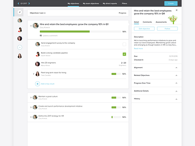
After drawing out countless mocks, and validating concepts through tons of user interviews. We found a concept we all agreed upon—a dynamic dashboard which would reveal information and controls depending on the user’s purpose. The challenge for designers in the OKR space is designing for ICs, managers, and executives. Everyone is different, but their purpose in the app is more or less the same.
HUGE props to the design team for their continuous support on this project, also the PM I worked with so closely.