HSCo branding 03 - the whole nine
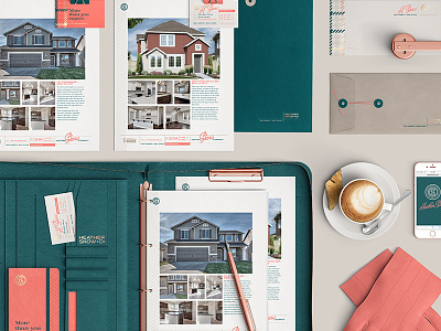
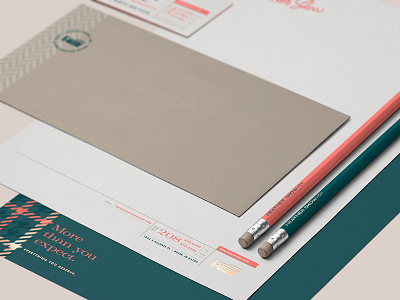
Here are a couple of dropdown views of the entire proposed identity system, and an example of a yard sign for my current real estate client.
Check those attachments for better and other views.
My branding presentation last Friday was met with a somewhat lukewarm response. I think a lot of my client's opinions of the creative were tainted by her feelings about the colors, which she did not like — the least of which being my proposal to use rose gold foil accents.
So unfortunately, changes need to be made, mostly regarding color.
Anyway, just wanted to share my original vision with you guys.
More by atomicvibe design lab View profile
Like


