Big City Guide: Animation.
Hello, dribbblers!
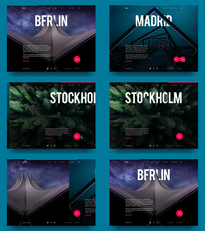
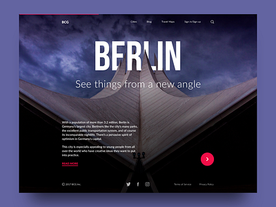
Here is the last shot in the series presenting a web design concept for the Big City Guide, the online service providing travelers with the information about big cities all over the world. This one presents the full animated version of the landing. Keeping the consistent scheme of all the pages for different cities, the name of the city in each case becomes the center of the composition, bold and quickly readable in strong uppercase letters. The word is inscribed into the thematic picture setting the quick association with a particular city. The subheading presents the motivating line whose message harmonically combines with the image of the city. Smooth animation adds the dynamic nature of traveling and supports the feeling of consistent interaction. Catch the vibe, guys!
To share more ideas we get working on design projects and concepts, we regularly update Tubik Blog with new articles. One of the latest post presents the collection of 12 Creative Concepts of Interface Animation. Join in!

