SaaSFest 2015
SaaSFest 2015 was a business event for professionals involved with Software as a service, or sass. When I was called to create the event’s logo and some of its printed material, the client had an idea of combining the sass initials with sass as in sassy. The visual identity should therefore try and break with the expectations of this being just another event for squares.
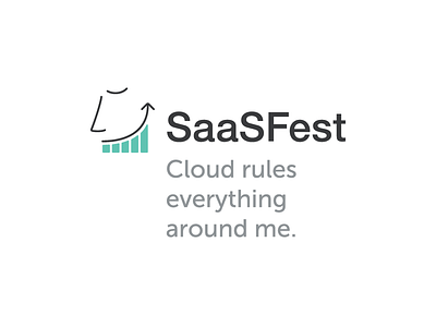
The symbol I arrived at tries to expand on this double entendre: depending on how you look at it, it is either a graph, indicating growth, or a cheeky smiling face. Yes, this was a business event dealing with the very serious topic of helping entrepreneurs to optimize their (SaaS) business, but at the same time I tried to emphasize this characteristic of the event as a chance of relaxed dialogue between peers.
More at http://caluapataca.com/branding/saasfest/ and http://www.preface.com.br/projetos/54
