iOS Camera Tweak


I wanted to mock up a slight UI change to the default iOS Camera app that has seemed so obvious to me for a while...
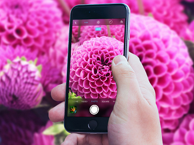
Currently on the 'PHOTO' and 'SQUARE' screens of the camera app, the background to the navigation/settings UI is opaque black, bringing a strong focus to the text and controls of the camera, rather than the image in the viewfinder -- the other screens use a translucent black...
The image blur underneath of translucent black makes more sense to me on these screens, as the blur can transition smoothly (i.e. dragging the home screen down to reveal Search and Suggestions), feels more consistent and it still leaves the impression of the true image size/aspect ration, without getting in the way...
(I also tweaked the highlight color from yellow to blue, it reminds me of the dark color scheme used in the Maps app)
But, I'm interested to hear what others think about this... Has anyone ever noticed or thought about this before? Swipe through your camera app and tell me what ya think.
Real pixels are attached.