Primary Visual
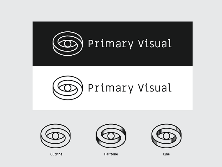
Direction 01 for a filmmaker who wanted a logo that focuses on "the mind's eye". Thought an optical illusion option made sense.
Lightened up the mark a bit to match the type. I'm really digging the "outline" version, but created two alternatives (halftone & line) for consideration. Needs a touch of kerning, but good enough for the pitch.
More by Joshua Gille View profile
Like

