Car UI Cluster
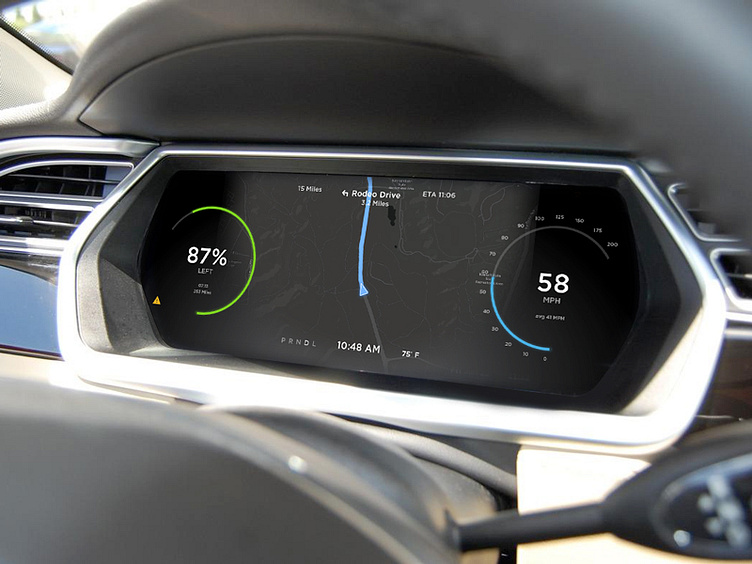
Some refinements on the last design. This one has an indicator light on the side.
I never understood why so many of these display dashes show the car on a road. The road doesn't do anything, like turn as the road does, and at best shows that my lights are on, while putting things like the navigation over on the center console. Bringing this front and center with range and speed give the driver all the information they need.
More by Alex Benson View profile
Like

