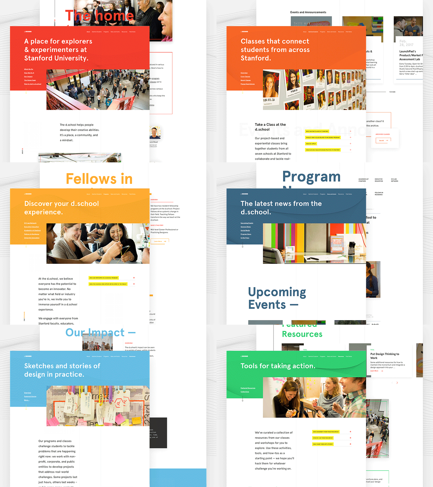
Stanford d.school - Designing a system
We approached this d.school site with a series of principles.
1. Give people tools and minimize restrictions.
2. Design should provide structure and consistency, not constraints.
3. Embrace the (constant) change.
4. Keep things modular. Allow for options and opportunities for people adding to the site.
Taking these principles, we worked with their amazingly smart team to design a visual system. We utilized bold color to establish clear organization of the different sections. We also created a modern aesthetic and repeating UI patterns that created a visual consistency across the site.
Check out the live site here: dschool.stanford.edu
And read our case study about the process.
----
Like what you see? Follow us on Instagram to stay up with our studio.
