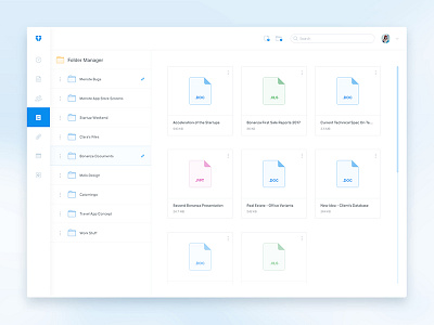
Dropbox Redesign Intro Part
Recently i've been thinking about making some redesign of something for fun and Ok, i finally decided what exactly i'm gonna be redesigning.
Hey Dropbox, beware! Crazy or lazy pixels are coming at ya!)
Guys, what do you think, which sidebar to use better? White one or the blue one? Please write in comments which one you like more, and critics as well. Watch only in real pixels. Thanks!)
And don't forget to click "L" if you like it and also follow me for more updates of this project.
More by Dmitriy Kharaberyush View profile
Like
