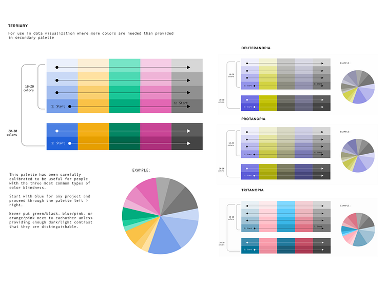
Data Visualization Color Palette
As part of our rebranding we are exploring expanded color palettes for data visualization. About 10% of the population is color blind so we're making sure our colors work as well as possible for as many people as possible.
Our team recommends Color Oracle for checking how your designs work for the three most common forms of color blindness: http://colororacle.org/
More by Fresh Tilled Soil View profile
Like
