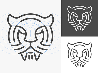
Sabertooth Brandmark
This was a failed concept for a sabertooth brandmark. Designed on a grid using 9 circles. It was fun and a bit outside of my normal work but at the end of the day was a bit busy for the minimalistic brand esthetic.
More by Paul Hershey View profile
Like


