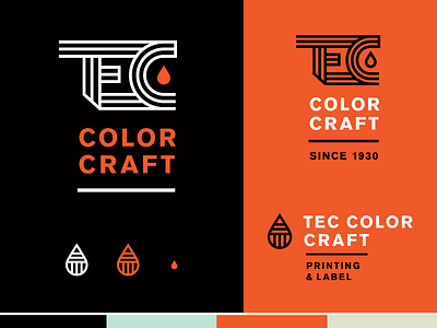
TEC Logo Option 2 brand elements
When we built this system out we thought it would be nice to have an alternate logo icon to the main TEC that was simpler but utilized the paint drop and the thick lines from the main mark. Thus the simplified T in the paint drop. The favicon is a simple bold paint drop with the brand color. Sad to see this option end up on the cutting room floor, but VERY excited for the option we are moving forward with and feel like it is the best option overall! Stand by to see in our final mark in the coming weeks.
More by Hoodzpah View profile
Like
