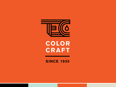
TEC Logo Option 2
Some custom lettering for the monogram/icon for TEC. We tried to think of the mark as we intended to animate it for video and web usage if they chose to go in this direction. The lines would come in from the left and fold and curve to spell out TEC, and the paint drop would fall into place. This brand is very good at doing trade shows and marketing themselves through video pieces and e-newsletters to clients, so we thought this could be a fun option that was bold, simple, scaleable, and edgy. They work with a lot of action sports brands so we wanted their logo to feel like it fit in the same sphere of snow/skate/moto/surf.
More by Hoodzpah View profile
Like
