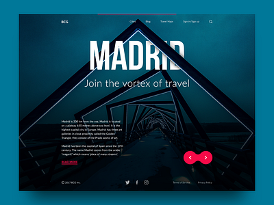
Big City Guide: Madrid.
Hi guys!
Here is another shot presenting web design concept for the Big City Guide, the online service providing travelers with the information about big cities all over the world. This one features Madrid. Keeping the consistent scheme with the page we featured here before, the name of the city becomes the center of the composition, bold and quickly readable in strong uppercase letters. The word is inscribed into the thematic picture setting the deep perspective with the modern construction echoing the form of the swirl or vortex. The subheading presents the motivating line whose message harmonically combines with the image and the associations set by this energetic and bright city. Next shots will show you the pages presenting other cities as well as the animated version, stay tuned!
To share more ideas we get working on design projects and concepts, we regularly update Tubik Blog with new articles. The latest article gives the insights into the issue of Color in Design: Influence on Users’ Actions. Join in!


