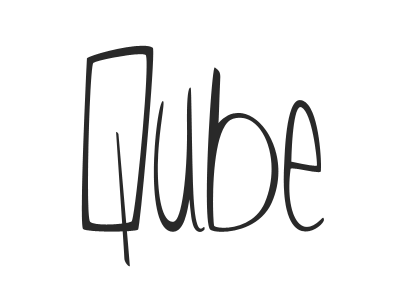
Qube Logo v2.2 (scaled)
More refinement on the logo.
I concentrated on the U and the tail of the Q for this update.
Removed 'Clothing' as I can't find a suitable font that fits in with the rest of the logo. Thinking I'll work on something custom for that as well.
Edges are a little blurry due to a simple resize.
Feedback is appreciated!
More by Jordan Borth View profile
Like


