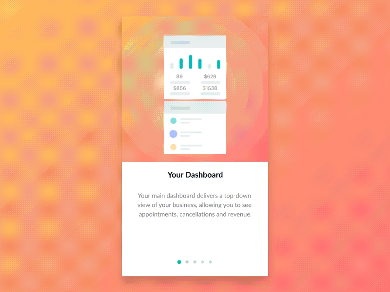
Setmore - New features walkthrough
While designing the Setmore mobile app, we have been using onboarding techniques to introduce existing users to new features.
Rather than throwing people blindly into a seemingly endless tour of the app, Setmore uses dots at the bottom of the screen to indicate my progress through the guided tour. So does Inbox by Gmail. It might be clear, but designers often forgot these small details.
This is one of the mobile apps we designed at www.plat4m.com. As always, we were responsible for the UX flows, User Interface Design, Micro-Animations and more.
Design by @Majo Puterka
More by PLATFORM View profile
Like


