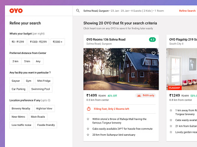
Search results page
A concept exploration for OYO search results page with all the data we users may need to select an OYO over another.
We have been using a pinterest style two-column grid till now, but as data points have increased by virtue of our endeavor to help them make the best choice, that layout is not working anymore for us.
This new layout will require some engineering magic so that a users vertical scroll action translates to an effective horizontal scrolling. It enables viewing upto 3 full cards at a time and is able to show a whole lot of data w.r.t each hotel.
Critical analysis welcome :)
More by OYO View profile
Like

