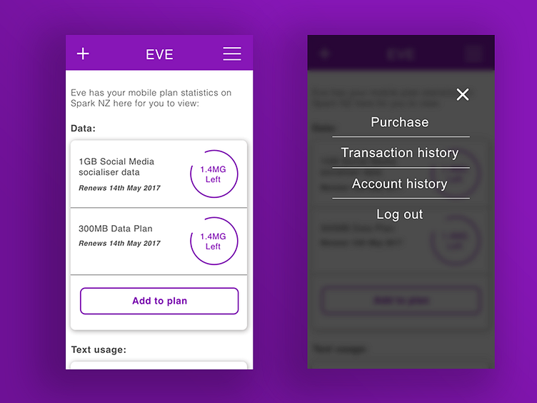
EVE mobile menu
I have noticed a lot of mobile menu UI designs appearing as full menu designs.
Although I don't think it suits a menu with a lot of options, I feel for a menu with around 3-5 options is a good fit for this design.
I decided to give it a go with my UI/UX design with EVE and visioned it with a transition effect to fade in and out each time a user clicks the burger menu icon.
More by Michael Szeto View profile
Like
