HSco 11 - Devil's in dem details
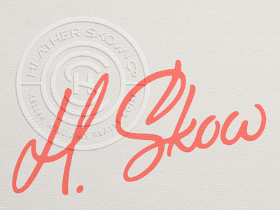

In an attempt to make this logo look more like a genuine signature, I decided to take my clean, smooth vectors, and add in some intentional imperfections.
I'm no @Rob Clarke (the Authentic Looking Signature Grandmaster), but this is a start.
This was a relatively quick exploration; if the client approves this concept, I'll spend the much needed time tweaking each individual letter obsessively.
Click that Z for deets and check the attachment for comparison.