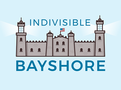
Indivisible Logo - Take 2
hey so, take two of this logo looks a lot more like the actual Twin Lights but it's also kind of evil and imposing looking. almost like a prison. so i'm not going to use this, but it looks cool
More by Jim Silverman View profile
Like
