Ari
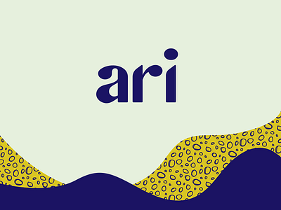
Here’s the custom logo type I designed for Ari. I wanted to build a serif / sans serif hybrid. Always loved the style of a serif but I wanted some clean lines to go with the overall look of the brand. I spent a little over a week working out these three letters like they were in my head.
With a simple and short name, I decided not to make a symbol for the brand. If the type has enough remembrance on it’s own, you don’t need to muddy up the brand for the sake of adding a mark next to the type. The mark is typically displayed next to patterns and packaging symbols throughout the brand system as well - so no need for multiple marks in one spot.
Anyways, I just wanted to explain how specific brands don’t always need a symbol or icon.
More by Kyle Anthony Miller View profile
Like
