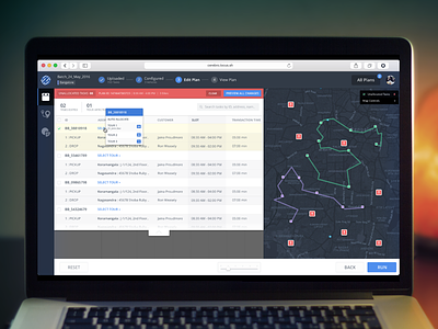
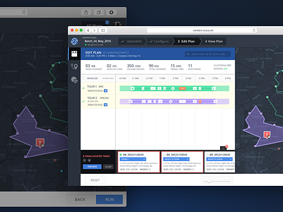
Unallocated Task View
To make allocating tasks to a tour even more easier we moved from a horizontal scrolling card view to a full fledged overlay table view.
Because of this we had to let go of the visibility of the gant chart which was there in the earlier design. But overall the allocation flow gets a lot more prominence here, with features like search and overall stats (moreover the change of color of the header to red gives the user a sense of being in a separate section where he needs to take care of the errors)
Also we added a multilevel table for separating the various visits inside a task and changed our top bar to incorporate material steppers :)
Higher pixels attached
More by Vaibhav Bhasin View profile
Like


