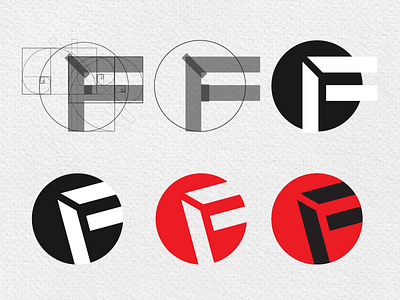
Full Circle Brand Mark
I am finishing up the identity design for a fine art & photography service provider. We wanted to design a simple modernist mark that captured some of their service offerings (like framing, printing, reproduction, fine art, etc) without being too literal, while achieving a little bit of an "ah-ha" effect. The "F" shape stands for Full, while the circle is, well you get it.
Once we had a solid concept, I pulled out the trusty golden ratio spiral to help bring harmony to the proportions and design. You can see the progression of the design here. What do you think?
More by Bobby G | Propr Design View profile
Like

