SpiceWorld Logo Iterations
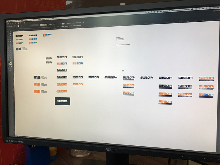
I recently refreshed the SpiceWorld logo (will upload later), and here's my artboard exploring a bunch of different directions.
The idea was to come up with more of a wordmark than a logo. A wordmark that could possibly change year-on-year. We wanted something flat, simple, easily repeatable across multiple materials (t-shirts, large signage, badges) and obviously techie as it's an event for IT professionals.
I initially set out to explore 'connections' to symbolise the connection of IT pros and tech vendors at the event, so many of these versions have connecting letters or blocks.