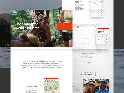
Strava Homepage Full Comp
Here's the full pixels of the Strava.com homepage.
It's always weird looking at full pages like this. Nothing on here looks that extraordinary as far as design goes. But so much research, conversation, versions and iterations all lead to it. That's my favorite type of work. Execution is often fleeting and only one facet of the larger strategy. Now I just hope that it all works!
BTW, this site is nothing without the awesome photography by folks like Jake Stangel and Kyle Johnson.
Still freelance and going strong. Hoping for more great projects in 2017 so as always:
More by Dave Soderberg View profile
Like

