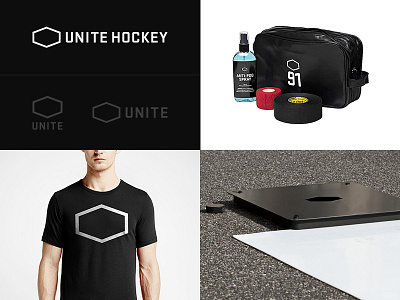
Unite Hockey Logo Feedback
Three years ago I started Unite Hockey together with a friend of mine with a simple goal.
"Take your game to a new level with the best hockey accessories on the market."
Now we're at a stage where a refined version of the logo would be perfect to have since our business is growing and we want it feel like a great sports brand.
I did it rather quick back then and I remember it wasn't quite perfect, but good enough. There is something with the balance and dimension of it that doesn't feel right, and still does. These three years of looking at it everyday have made me completely blind to see what improvements can be done.
I couple of times throughout the years I've tried to come up with a new solution but nothing have felt great.
The symbol does a decent job when applied on the products, except that it almost feels like there is something missing inside of it because it's so simple.
The logo itself always feels difficult to apply. Even in the website header because it feels unbalanced.
I need a fresh pair of eyes. I would appreciate some feedback on this.
Note: The logos in grey are ways to simplify it. Although when symbol and text below is applied on for example a t-shirt it does not really cut it.
Thanks!
