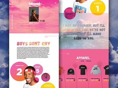
Boys Don't Cry Landing Page
Just another fun mock up to help me keep up on my web design. This one is for a theoretical landing page for everyone's favorite ocean, Frank Ocean. So far it's not entirely finished so I'll probably end up making a gif to show how the site would interact live.
Frank's musical and artistic style is incredibly interesting and a little unusual. That was the main attempt at this mock up. The header video has an almost surreal effect to it with the album cover hovering over a body of water. The pink and white color scheme is based off my personal favorite song off the newest album. The circles around Frank will mostly likely scroll up at different speeds through parallax. Looking to add a possible social media and upcoming tour section, as well as the footer.
So far I'm liking where this one is headed. Looking forward to finishing this one up. Enjoy :)
