Onboarding Animation
Hi there,
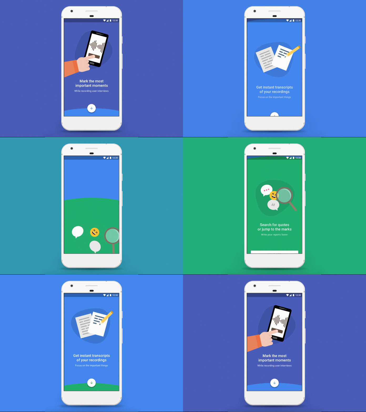
Almost all the onboarding flows that I've seen before move horizontally, so I've decided to come up with a vertical solution. Swiping up may be more natural than swiping from the right to the left, so going through a flow like this can be more convenient for users.
Users often don't like typical feature onboarding screens, they want to jump right in and discover the app on their own. This is why I tried to create something fun and lively. Also, I think simple and straightforward illustrations can help them get your message.
About the concept: this is a make-believe onboarding flow for Marky, a smart voice recorder, that I've worked on recently at UXstudio.
I really enjoyed working on this animation with Principle - using drivers for the first time:) I'll definitely use this feature more often.
I hope you like it, and if you have anything in mind, feel free to write me a comment. I'd be happy to get some feedback.
Best,
Zsolt
