Pied Piper Rebrand
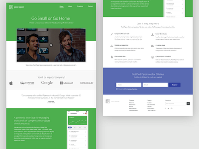


Here's a rebrand for America's favorite start up. This rebrand hopes to channel the core of Pied Piper's mission--simplicity. I began by adapting a new logo featuring simple geometric shapes and a subtle, sans-serif treatment. A new bright palette featuring a fresh take on Pied Piper's signature green also breathes new life to the brand.