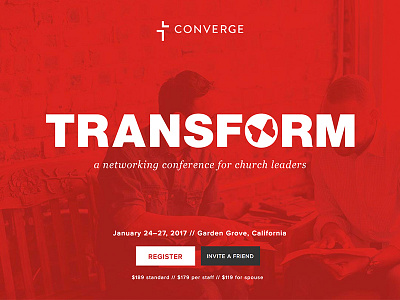
Transform Conference Hero
The landing area for the Transform website. This was my fourth year making the conference website, and I'm really proud of how it turned out. I got to spend a little more time designing/developing this one than previous years (still not as much as I would like — there's always improvements to be made).
Of the three conferences we've marketed at Converge, Transform has always had the boldest look to it. Fun team effort with Gabe and Josh. Check out the site and previous years at http://convergetransform.org.
Designed in summer 2016.
More by Ben Stankich View profile
Like
