Email Client Market Share Redesign
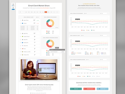
Here's a really old rough redesign of emailclientmarketshare.com - a tool that shows the top 10 email clients by open every month. This was one of those projects that just got abandoned with team and role changes.
The UI is outdated, but the key UX improvements (in my mind):
- Easy navigation between months and past reports
- Fixed social sharing on scroll to encourage more sharing
- Added in stats for opens by environment and opens by rendering engine for each month
- Each key stat area (i.e. leaderboard) is embeddable for other sites
- Added overview report breakdown video + blog post for each month (if available)
- Call to action to receive email updates each month
- Historical graphs of the core metrics to see trends over time
- Downloading the data into Excel/Powerpoint/Keynote for easy sharing in presentations
I think this vastly improves the information people are looking for and makes it more accessible. Hopefully we can revisit this in the future and actually ship an updated version!
---
Again, ignoring the rough UI mock details, what are your thoughts on the UX suggested improvements?

