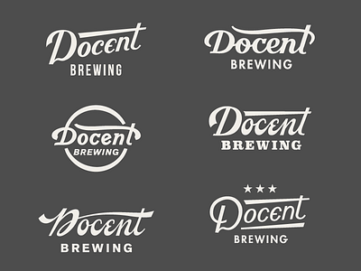
Docent Logo Exploration 2
We did a lot of custom lettering options before we arrived on our final logo mark for Docent. Click the attachment for all the mocks. Between these 8 mocks there were probably 64 variations on these throughout the process. It was a lot longer than our normal method, but we wanted to make sure it was done right and the client was happy. So extra revision rounds were tacked on till the job was done. Our main goal was a script style logo that was legible from afar, memorable, and would look killer on the front of a can, practically on it's own. Left hand sid, bottom 2 are the ones we moved forward with.
More by Hoodzpah View profile
Like

