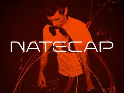
Natecap V3
I was a bit annoyed at my last design and since this guy takes it super easy i swung another idea his way.
I totally threw the type around since i find the hard edges and "squareness" of the previous logo didn't flow with his type of music, now it's just more "in flow" with the music, and has a sharp edge, just like Nate himself :)
Would really like some of your feedback on this,please tell me what you think...
In the attachment there's a bigger version of the logo so you can easily see the typography.
Photo is © MR Riot Photography
More by Richard de Ruijter View profile
Like

