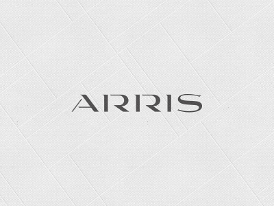
Arris - logotype
Don't know why I never got around to uploading this.
It's a custom logotype for a super-duper high end apartment building in Washington, D.C., that I did a while back while working at HZ.
We named the property, too. Based on the angles and unique shape of the building itself, we named it "Arris," an architectural term meaning "a sharp edge formed by the meeting of two flat or curved surfaces." So the logo and the resulting branding plays off of this angularity.
Also, the majority of the building is glass, so the concept of light is a big part of the aesthetic. Hence the super contrasty letterforms. The branding uses a stark palette of black, white, and gray, as well as silver and white foil accents.
More by atomicvibe design lab View profile
Like
