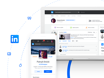
Linkedin Redesign
Linkedin need new look, so I decided to create my concept.
Main case was the some grid (with little changes) and corporate font Source Sans, because I think that users won't have the frustration with a new design in first moment.
Take a look at attachment or go to Behance presentation.
Thanks!
More by Patryk Ilnicki View profile
Like


