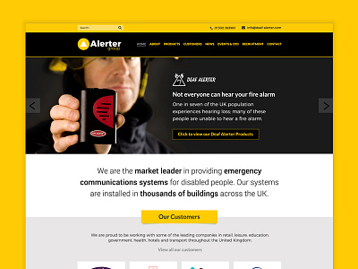
Alerter Group homepage
Alerter Group's brand changed from maroon to yellow so they wanted to see different options of how the website could work after introducing the yellow.
Yellow is a difficult colour to work with especially with lighter shades and in gradients which the previous design had. I produced four options for the homepage and all included the new typefaces but lost the gradients.
The examples ranged from a dark version, where yellow was the easiest to read to a much lighter version with a lighter slideshow. In the end, the client opted for a concept somewhere in the middle (light but with a dark header and slideshow.)
I'm pleased with how modern the design now feels with the new type and logo.
More by Katherine Cory View profile
Like


