Deskmetrics v2
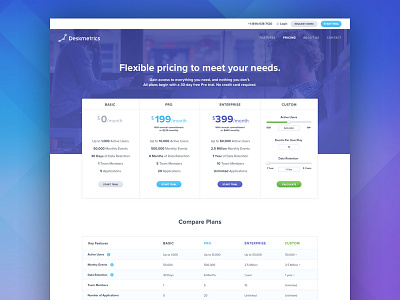
Hey Dribbbler's! Guess what? We just refreshed and restyled our Deskmetrics website! One thing we were finding (thanks Hotjar!) was that most visitors were navigating straight to the pricing page, and lingering there, so we needed to organize the page and make it more engaging. We also added some fun new elements like a custom plan calculator. Here's what we came up with. Please let us know what you think; we love the feedback! Make sure to check out the other changes, and clean new look here: http://deskmetrics.com
More by Redbrick View profile
Like


