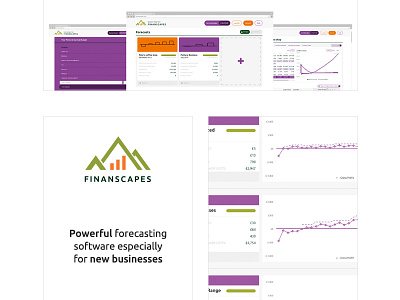
Finanscapes gmail adverts
Designing Gmail ads is an interesting job as there's an landscape banner and then two columns with an image on the left and text on the right with a CTA link. You can't customise the typeface or text hierarchy, you can only choose the colour of the CTA button.
Due to the restrictions, we decided to scale back the impact of the brand and have a calmer and quieter design for the Gmail ads, which matches the rest of the print work more!
More by Katherine Cory View profile
Like


